Candidate Profile: Redesigning the most-used page in Greenhouse
Role: Director of Product Design
Year: 2022
Team: 1 Sr. Product Designer, Product Manager, UX Researcher, 5 Engineers, Cross-functional partners
Context & Opportunity
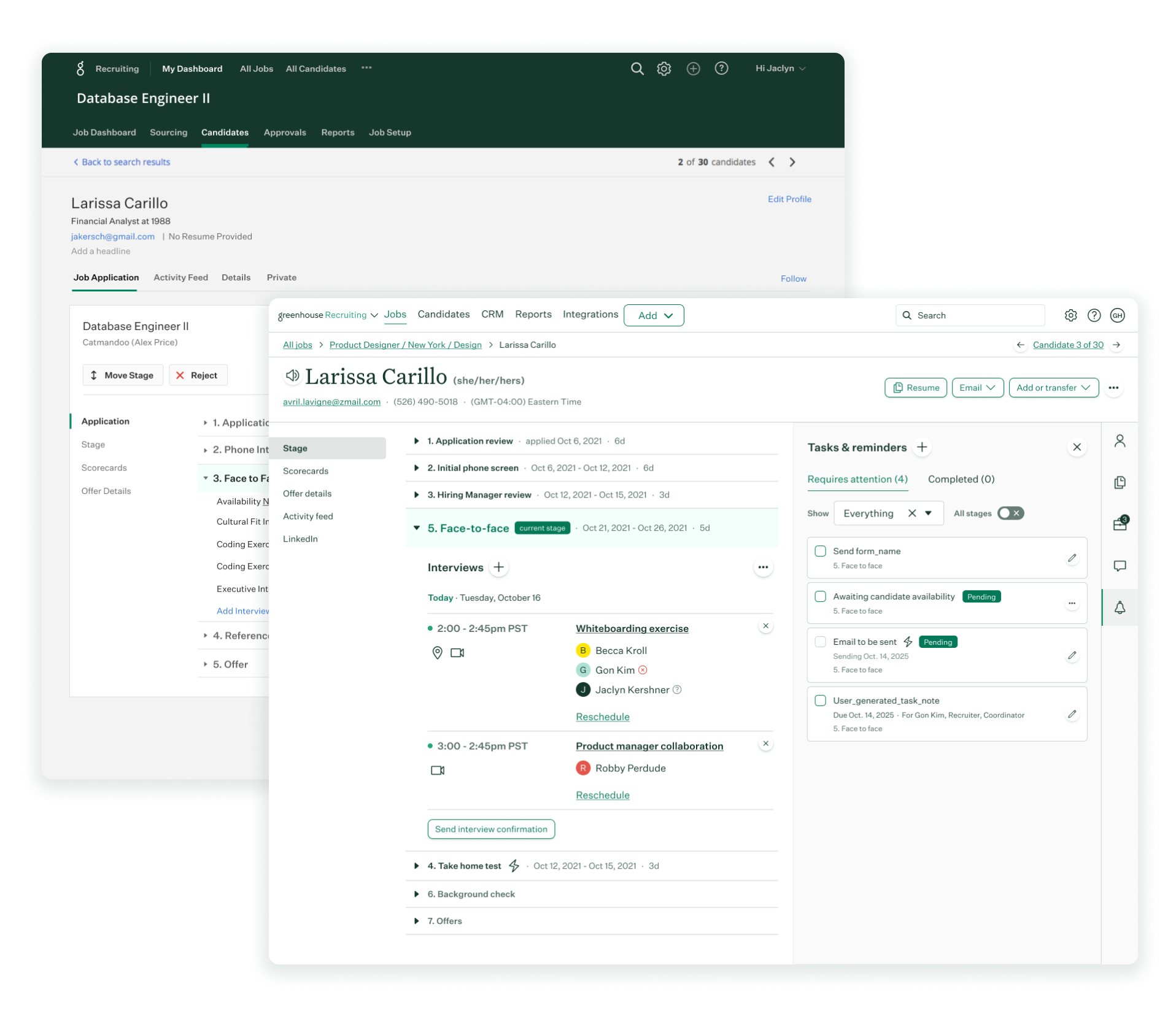
The Candidate Profile is the most-trafficked page in Greenhouse, supporting the end-to-end hiring process for recruiters, hiring managers, and interviewers. Any inefficiency here directly impacts hiring velocity, candidate experience, and user satisfaction.
Despite its importance, the profile had grown cluttered and inconsistent over time. Tabs hid key actions, dense layouts slowed scanning, and overloaded menus made navigation frustrating—especially for less-frequent users.
Discover & Insights
We began with in-depth discovery, combining analytics, support data, and user research to pinpoint pain points.
Quantitative: The Candidate Profile accounted for 75% of all product page views, but had one of the highest bounce rates among hiring workflows.
Qualitative: In interviews, users reported needing too many clicks to complete core actions and feeling “lost” when switching between candidate information and tasks.
Operational: Support tickets revealed recurring confusion around stage actions and interview kit access.

Research revealed issues in navigation clarity, action discoverability, and information overload.
My Role
My contribution was to set the strategic vision, align cross-functional stakeholders, and create the conditions for successful design delivery by the senior designers on my team.
Vision & Goals: Defined success metrics tied to reducing clicks for key actions, improving task completion time, and lowering support volume.
Stakeholder Alignment: Facilitated workshops with product, engineering, and customer success leaders to ensure the redesign addressed business, user, and technical needs.
Team Empowerment: Provided the design team with resources, executive visibility, and decision-making autonomy while ensuring they had the time and support to explore solutions deeply.
Quality & Consistency: Guided alignment with our design system (Birch), brand standards, and accessibility guidelines.
Cross-Functional Collaboration: Partnered with PMs to integrate the redesign into the roadmap and with engineering managers to ensure feasibility and performance goals were met.
Design Outcomes
The redesign delivered:
Navigation Shift: From tabbed navigation to a persistent left-hand menu for quicker access to profile sections.
Split-Panel Layout: Allowed users to view candidate details and take actions side-by-side without excessive page switching.


Prioritized Actions: Core actions like “Select interview kit” and “Email candidate” made visible and accessible.
Stage Details Accordion: Enabled expansion of interview stage details without losing page context.
Launch & Adoption
Pilot Rollout: Partnered with product and engineering leads to release first to select customers for early feedback.
Change Management: Coordinated with customer success to prepare training resources and in-product guidance.
Feedback Integration: Directed post-pilot adjustments to improve usability before full-scale launch.

Impact
42% reduction in clicks to complete key candidate actions.
98% improvement in task completion time in usability tests.
87% drop in Candidate Profile–related support tickets post-launch.
Positive customer feedback on clarity and ease of use.

Learnings & final takeaways
Redesigning a core, high-traffic page is never easy. These projects are often met with resistance, frustration, and negative sentiment from users accustomed to the old way of working. But they are also essential for scaling the product, reducing long-term friction, and enabling future growth.
As a design leader, I believe it is critical to be brave in the face of that early pushback. Every decision should be anchored in research, balanced with your instincts, and supported by a commitment to stay the course. Change at this scale requires a clear vision, strong alignment, and the confidence to see it through. Over time, as users experience the improved workflows, sentiment shifts, adoption grows, and the benefits become undeniable.