Birch: A scalable vision for a new design system
Role: Director of Product Design + Individual Contributor
Year: 2022
Team & Tools: Cross-functional collaborators, design tokens, component library, documentation site
Context & Opportunity
Seedling provided a starting point, but inconsistent adoption, design debt, and limited accessibility threatened speed, cohesion, and inclusivity. I recognized that transforming the design system was key to long-term scalability and design maturity.

From Seedling to Birch — improved visual hierarchy, cleaner layouts, and streamlined workflows that reduce cognitive load.
Research & Insight
Interviews and metrics revealed engineering friction—2 hours per card, 5 minutes per component import, only ~33% usage.
Designers spent 2 hours weekly resolving pattern inconsistencies.
20% of NPS complaints were usability related.
This business-critical inefficiency set the case for Birch.
Vision & Goals
I defined Birch as the visual and functional backbone for Greenhouse’s product design—accessible, responsive, and modular. Success metrics included:
Adoption rate by engineering and design teams
Time reduction per build
NPS and feature adoption lift

Birch’s visual language was designed for flexibility, legibility, and brand cohesion.
Strategy & Execution
I worked as both a director and an individual contributor, partnering closely with designers and engineers to transform Birch from concept to a robust, fully functional design system.
Full system audit: Together, we reviewed every component, pattern, and style in Seedling to identify inconsistencies, outdated elements, and gaps in coverage.
Use-case analysis: We evaluated real-world usage across the product, documenting where components broke down or lacked flexibility for varied contexts.
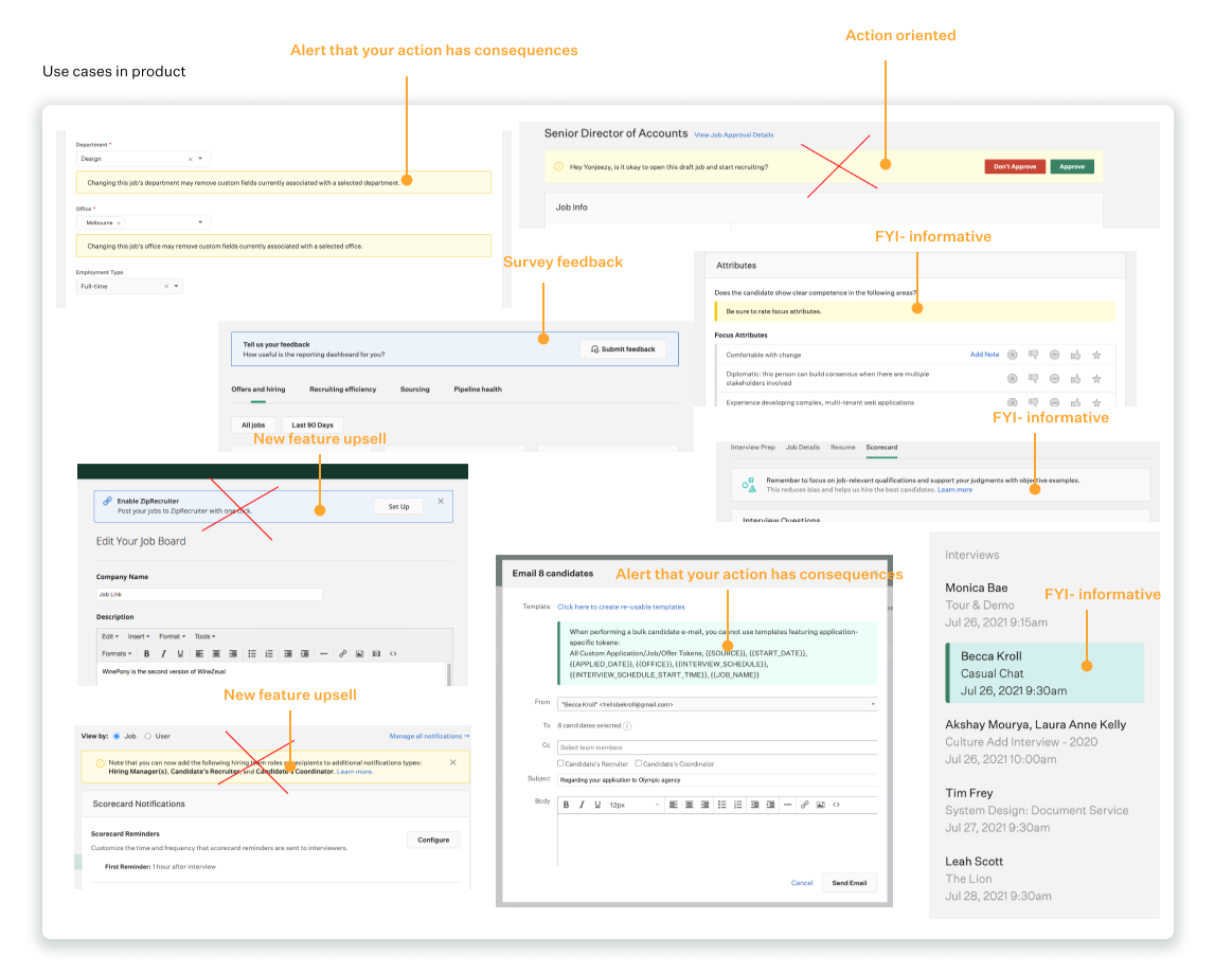

Iterative refinement: Each component was redesigned or updated based on accessibility standards, responsive behavior, and performance in our most demanding use cases.
Documentation & guidelines: We captured all decisions, interaction patterns, and usage rules in a central documentation site, ensuring clarity for both design and engineering teams.
Cross-functional collaboration: Designers, engineers, and QA worked side-by-side through design reviews, code pairings, and live testing to ensure each component was not only beautiful but production-ready.

Rollout & Governance
To ensure Birch was not only launched but fully adopted, I led a structured rollout plan with a focus on change management and long-term sustainability.
Champions program: Identified and trained design and engineering champions in each product area to accelerate adoption and provide peer-to-peer support.
Guided migration: Created visual migration guides and an interactive component browser so teams could quickly find, implement, and replace patterns.
Training & enablement: Hosted onboarding workshops, office hours, and recorded demos to equip teams with both the “why” and “how” of Birch.
Version control & contribution model: Established a formal release cadence, governance committee, and clear contribution guidelines to maintain quality and prevent system fragmentation.
Ongoing measurement: Tracked adoption rates, build-time reductions, and support tickets quarterly, using this data to inform roadmap updates and drive continuous improvement.
Results
Adoption increased from 33% to 97% within 3 weeks.
Engineering time per ticket dropped by 80%.
25% decrease in NPS comments related to usability
Designers spent 50% less time resolving UI inconsistencies.

Legacy & evolution
Birch now underpins new product areas, is used for faster prototyping, and supports mobile-first designs. Governance culture around the system helps sustain quality and speed as the product scales.