Greenhouse Redesign: Scaling Usability, Accessibility & Impact
Role: Director of Product Design
Year: 2021
Team: 3 Designers, 2 Engineers, Cross-Functional Stakeholders
The Problem
By early 2021, Greenhouse’s core platform had evolved to meet the needs of a broad and diverse customer base, but in doing so, the experience had become complex, inconsistent, and difficult to navigate.
51% of users reported a steep learning curve.
17% cited usability issues as a reason for churn, representing a significant business risk for a company operating at scale.
Inconsistent patterns and inaccessible components slowed adoption and made hiring workflows harder to complete, especially for non–talent team users.
For a product built to “make every company great at hiring,” this was not just a design issue. It was a threat to revenue, retention, and brand reputation.
The Bet
I proposed a company-wide initiative to reimagine our product experience around three strategic goals:
Unify the experience through a scalable design system.
Guide users toward hiring best practices through intuitive workflows.
Enhance access and accessibility to ensure every customer could fully use the product.
To secure buy-in, I partnered with product and engineering leadership to connect these goals directly to measurable business outcomes such as reduced onboarding time, higher customer retention, and improved sales enablement.
The Plan
I led a phased, cross-functional approach that allowed us to deliver value quickly while laying the groundwork for long-term change.
Phase 1 — Unify the Experience

Image of main inconsistent list views across Greenhouse
Directed the creation of a new design system, Seedling, replacing years of ad-hoc styles with a single source of truth.
Aligned design, engineering, and product on shared patterns, improving build efficiency by 80%.
Instituted a governance process to ensure consistency as we scaled.

Example of our updated design system styles
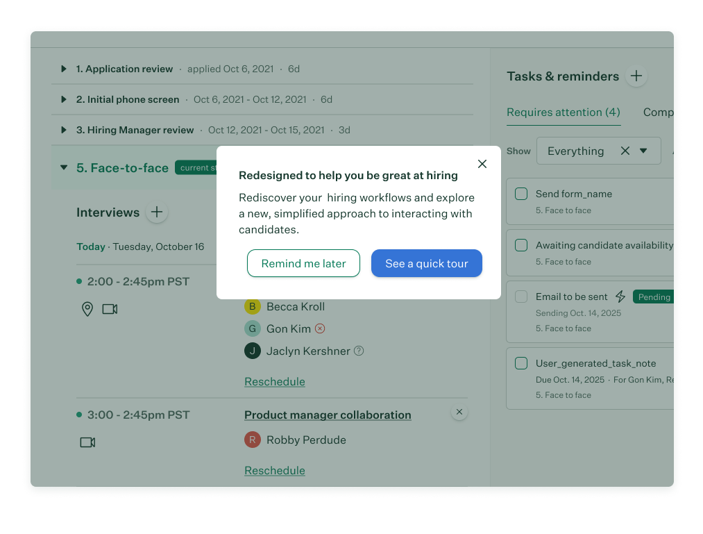
Phase 2 — Guide Users Toward Best Practices
Redefined key workflows including the candidate profile (our most-used page) to prioritize primary actions, reducing clutter and decision fatigue.
Introduced contextual help and onboarding popovers, improving self-service and reducing support tickets by 23%.

Phase 3 — Enhance Access & Accessibility
Engaged an external accessibility consultant to audit the platform.
Overhauled navigation and core workflows for full keyboard support, screen reader compatibility, and color-independent cues.
Made 10 core workflows fully accessible, ensuring compliance and inclusivity.


The Results
Business Impact
25% decrease in NPS detractors mentioning usability.
45% increase in adoption of new workflows via contextual learning tools.
80% faster engineering implementation time due to the new design system.
User Impact
Fully responsive layouts for key navigation and pages.
Accessibility compliance for 10 core workflows, expanding usability to all customer segments.
The Legacy
The redesign did more than modernize the UI. It reshaped how Greenhouse built products.
The design system became a foundation for future features across the platform.
Accessibility became a permanent part of our product development lifecycle.
I presented this work in a keynote at Greenhouse’s OPEN recruiting conference, aligning internal teams and customers around our vision for a more inclusive, intuitive hiring experience.

Final takeaways:
This initiative was as much about organizational design as it was about product design. It required setting a vision, securing executive alignment, leading cross-functional delivery, and embedding processes that allowed the company to scale design quality and accessibility for years to come.
View the press releases about the redesign and updated candidate profile here and here.