Brightwheel Forms – Driving Adoption Through Holistic UX Improvements
Role: Staff Product Designer
Year: 2025
Team: 1 Product manager, 4 Engineers, Cross-Functional Stakeholders
Context
As a director of an early education center, there are countless forms parents must fill out—enrollment packets, allergy information, health compliance documentation, and more. Traditionally, these are printed, filled out manually, and in some cases digitized again for state compliance. The process is time-consuming, error-prone, and requires constant maintenance.
Brightwheel’s forms platform was designed to solve this by allowing centers to create and send forms digitally. But in early 2025, only 15% of active customers create a form each month. We saw this as a huge missed opportunity to improve workflows for our customers and began an initiative to understand and address the barriers.
Research & Discovery
We started by combining quantitative analysis with qualitative insights:
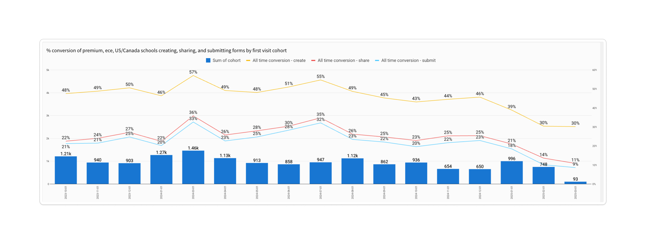
We see drop off across the funnel with an average of 54% of users abandoned during initial form creation
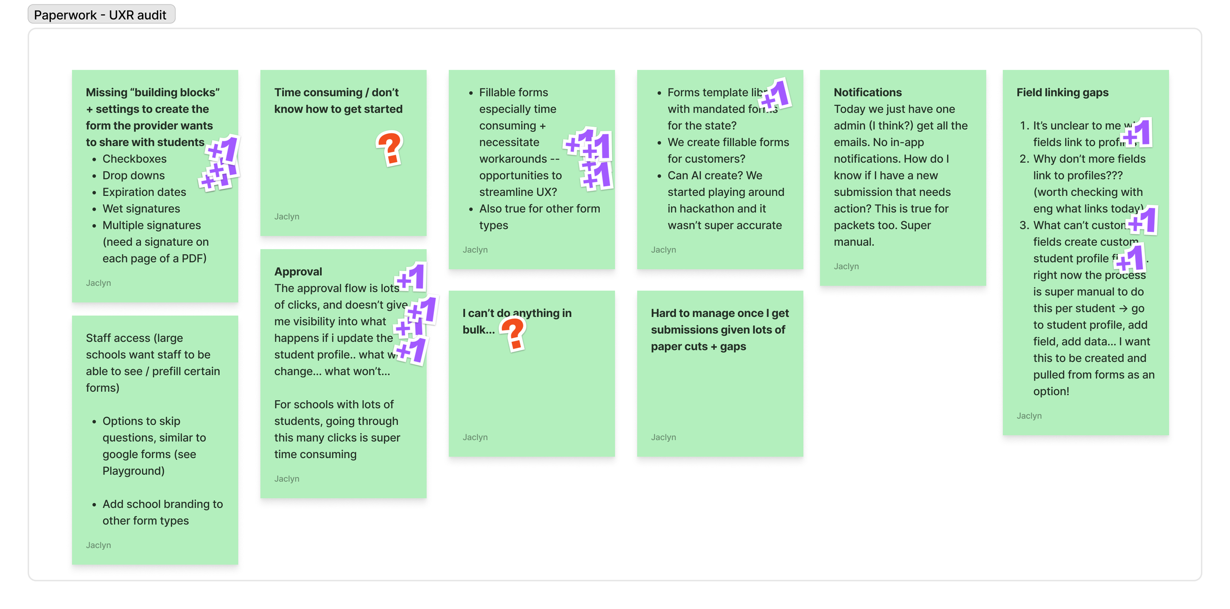
User feedback audit from support tickets and surveys. Over 30% of feedback mentioned missing field types.
8 in-depth user interviews with center directors and operators.
Our analysis revealed two major issues:
Low funnel conversion: 18% conversion rate from create to form submitted with the most significant (25%) drop-off at the start.
Opportunity far outweighed usage: Customers who did adopt forms saw measurable time savings, but this wasn’t translating to broader uptake.
Key Pain Points
From the research, three clear themes emerged:
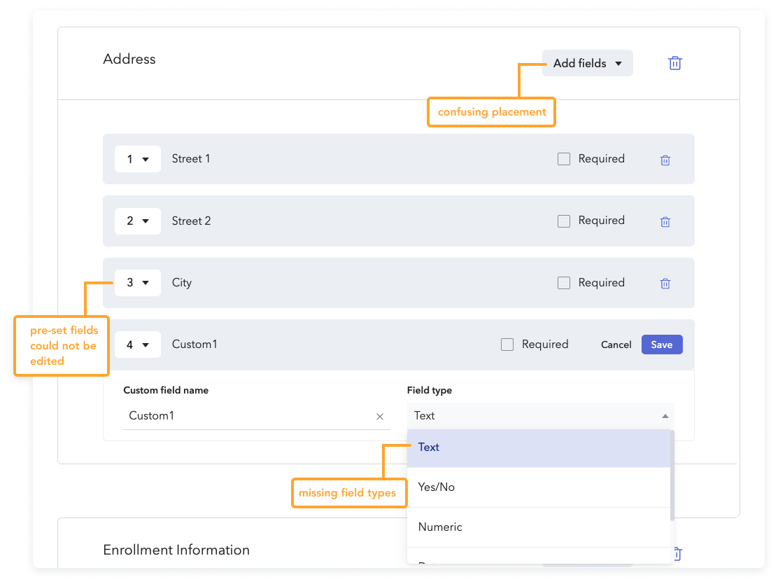
Limited functionality
Users often abandoned form creation because field types lacked flexibility and key types were unavailable, preventing them from executing required forms.
Time-consuming creation process
Forms often needed updating each year, and creating them from scratch was tedious and repetitive.
Inefficient review and approval
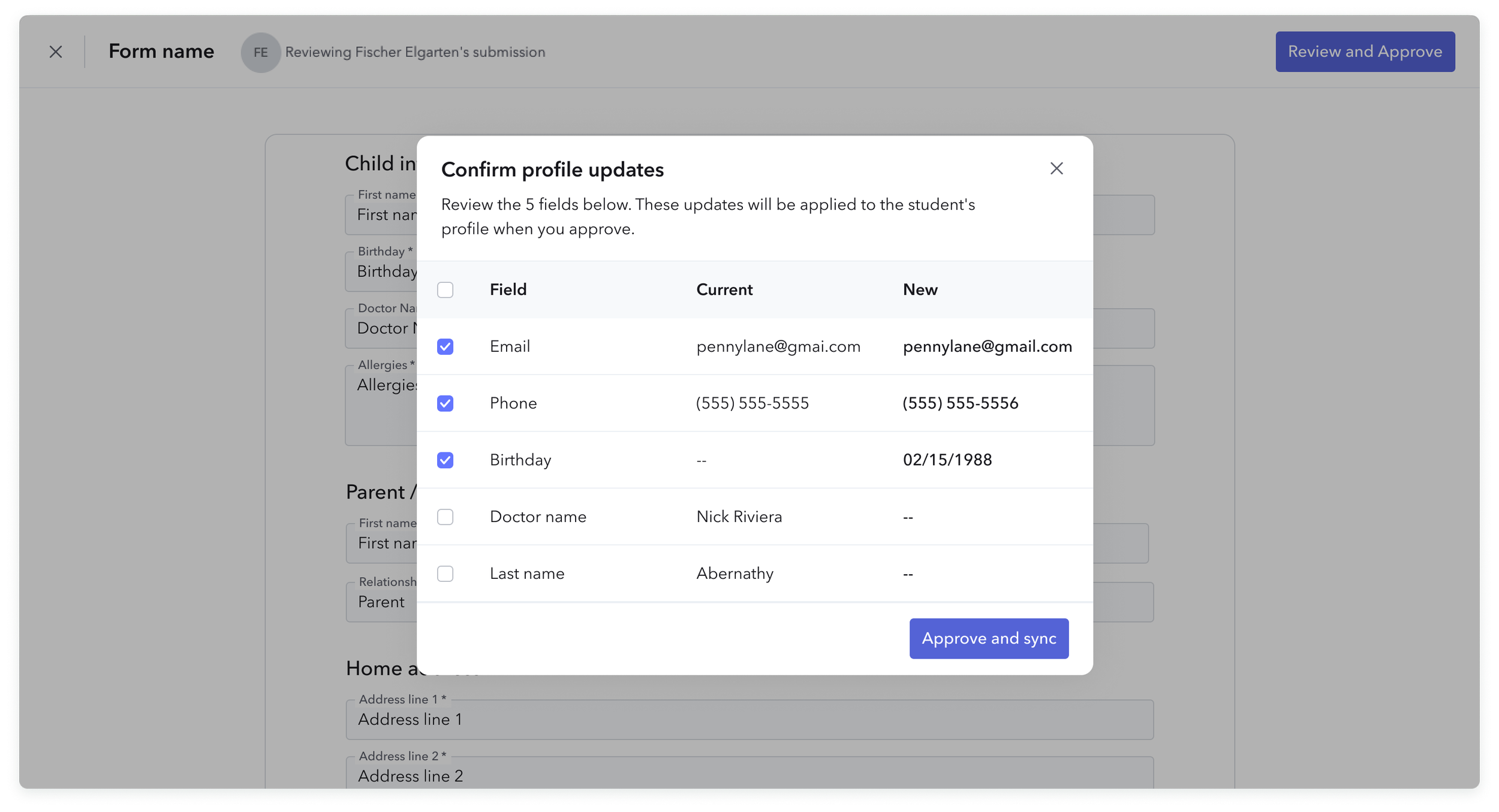
Once parents submitted forms, alerts were easy to miss, approvals took multiple clicks, and not all data synced to a child’s profile.
Opportunity Areas
We reframed these pain points into three solution pillars that could be delivered as incremental improvements but collectively tackle adoption barriers:
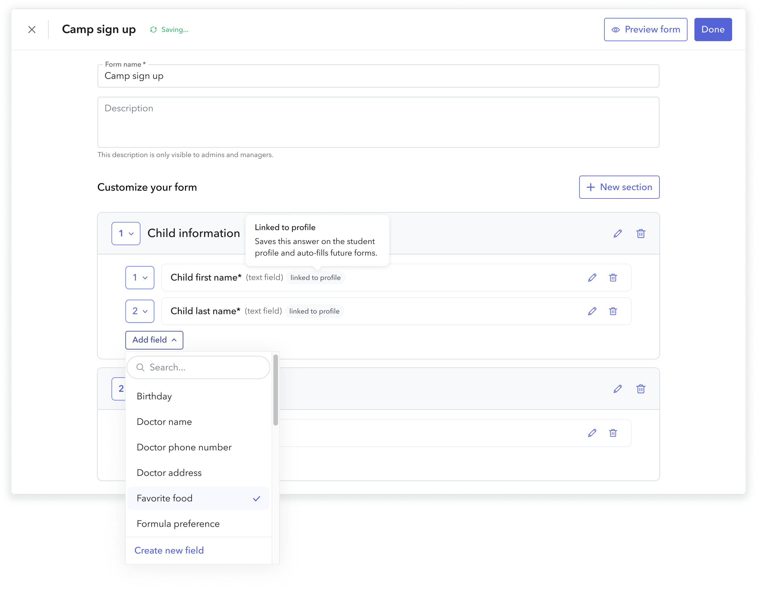
Expand core functionality – Introduce high-value field types like single select, checkboxes, and drawn signature fields to enable more form types to be fully digitized, covering 85% of the field types requested by customers.
Accelerate form creation – Provide ready-made templates, including pre-built fillable state compliance forms, covering the top 5 most commonly used forms and significantly reducing the effort required to get started
Streamline review workflows – Improve submission visibility, reduce clicks for approvals from 5 clicks to 1, and enhance data syncing to eliminate double entry.
Design Solutions
1. Expand Core Functionality
To remove major blockers for adoption, we introduced three high-value field types—single select, checkboxes, and drawn signature fields.
These fields covered 85% of the most requested customer needs, enabling directors to fully digitize the majority of their forms.
The design ensured each new field type followed existing component patterns for consistency, while meeting accessibility standards.
We validated interaction patterns with usability testing, ensuring fields worked seamlessly on both desktop and mobile.
2. Accelerate Form Creation
We launched ready-made templates, including pre-built fillable state compliance forms and commonly used center-specific forms.
Templates were organized into categories for quick discovery and could be customized after selection.
We partnered with our compliance and content teams to ensure all state forms were accurate and kept up-to-date.
The new “start from template” option was placed prominently in the creation flow, reducing dependency on starting from a blank form.
3. Streamline Review Workflows
We redesigned the submissions review process to make approvals faster and data syncing more transparent.
Added a status for “Needs approval,” and filtering to drive action.
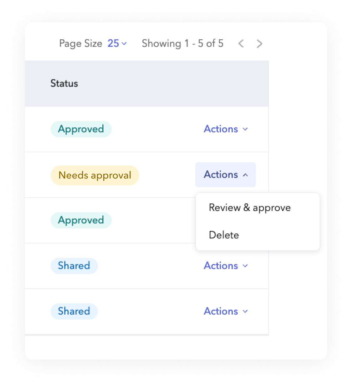
Introduced profile-sync indicators showing exactly which fields would update a child’s profile, reducing uncertainty and manual re-entry.
Consolidated the approval process to only require approval reducing unnecessary clicks and included visibility and control when fields sync.
Launch & Adoption
We rolled out each feature individually to monitor performance and fix early issues before the next release.
Provided in-product guidance for each new update.
Partnered with product marketing to prepare assets for a Back to School launch in September, timed to peak form creation season.
Impact
+2% organic adoption of Brightwheel Forms before any marketing push.
Covered 85% of requested field types, enabling the majority of workflows to be fully digital.
Reduced approval completion time (qualitative feedback from admins indicated faster turnaround and fewer follow-ups).
Increased form creation speed through template use, especially for new administrators.
Reflection
This project reinforced how impactful it can be to address multiple workflow bottlenecks in parallel. By delivering new fields, templates, and approval process updates together, we brought Brightwheel Forms much closer to being a complete, scalable alternative to paper for schools.